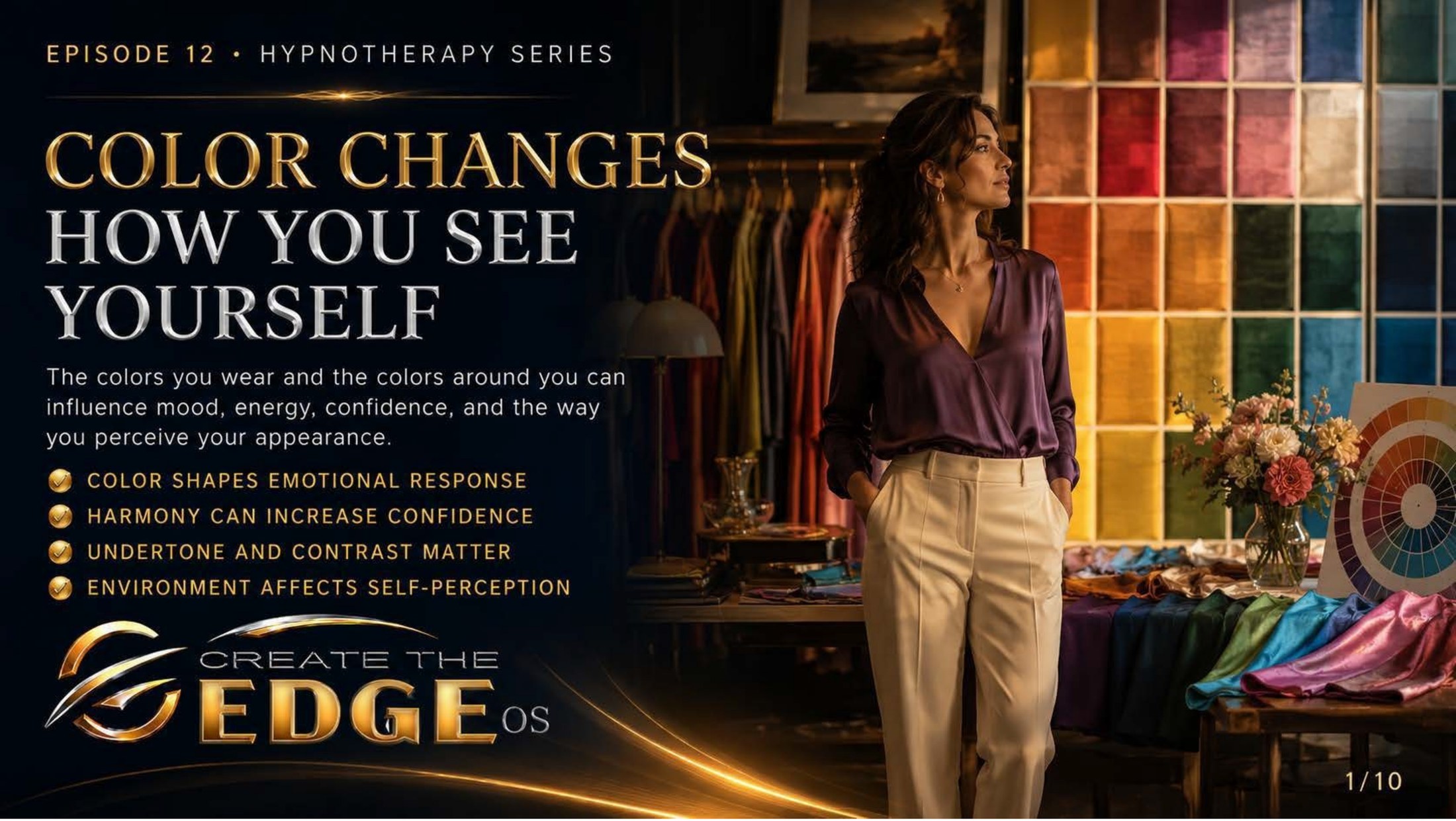
On the slideThe colors you wear and the colors around you can influence mood, energy, confidence, and the way you perceive your appearance: color shapes emotional response · harmony can increase confidence · undertone and contrast matter · environment affects self-perception.
Episode 12 · Slide 1
Color Changes How You See Yourself
Let me start with a small confession, because I think you’ll recognize it. There are mornings I’ve stood in front of a full closet and felt like I had nothing to wear — not because the clothes were wrong, but because I felt wrong, and no hanger was going to fix that. And then, every so often, I’d pull on one particular color and something would shift. Shoulders back. Chin up. A little hum of there she is. Same body. Same morning. Different color. And suddenly, a different woman looking back.
Look at the woman on this slide, standing in a studio washed in every color of the spectrum, a wall of swatches glowing behind her like stained glass. She isn’t being measured or judged. She’s standing in the middle of all that color like someone discovering a language she didn’t know she could speak. Because that’s what this chapter is — not a rulebook about what you “should” wear, but an invitation to notice something you’ve been feeling your whole life without naming.
And here’s the truth the slide names plainly: color shapes emotional response. This isn’t mysticism, and it isn’t vanity. The colors around you — on your body, on your walls, in the light of a room — reach the brain before a single conscious thought forms. They move your mood, your energy, even how confident you feel, often before you’ve noticed they’re doing anything at all.
I want to be careful and clear right at the start, because this chapter sits beside a tender one. After everything we walked through about body image and the cruel inherited lens, I am not about to hand you a new set of standards to fail. Read the slide again: this is about harmony, not correction. About color as a tool that supports you, never a test you pass or flunk. There is no “wrong” you here. There’s only what feels alive.
Because color does something willpower can’t. You can spend an hour talking yourself into feeling confident and get nowhere. But put on a color that genuinely lifts you, and the feeling can arrive sideways, without the argument — the way a good song can change your whole mood before you’ve decided to let it. Color is a back door into how you feel. And in a chapter all about how you see yourself, a back door is worth knowing about.
Notice that last point on the slide — environment affects self-perception. This goes beyond clothing. The colors of the room you wake up in, the light you get dressed under, the spaces you spend your hours in — they’re all quietly telling you a story about who you are and how the day might feel. Most of us never chose that story on purpose. This chapter is about getting to choose it.
And I love that this comes right after the body-image work, because it’s the gentle, practical, almost playful next step. We did the deep excavation — the inherited labels, the inner critic, the mirror learning to go neutral. This is lighter. This is the part where you get to experiment, to play, to notice what makes you feel like yourself. After all that heavy lifting, you’ve earned a little color.
So take my hand and step into the studio with me. We’re not here to find out what’s wrong with how you look. We’re here to discover what makes you feel alive — one color at a time. Let’s go find your colors together.
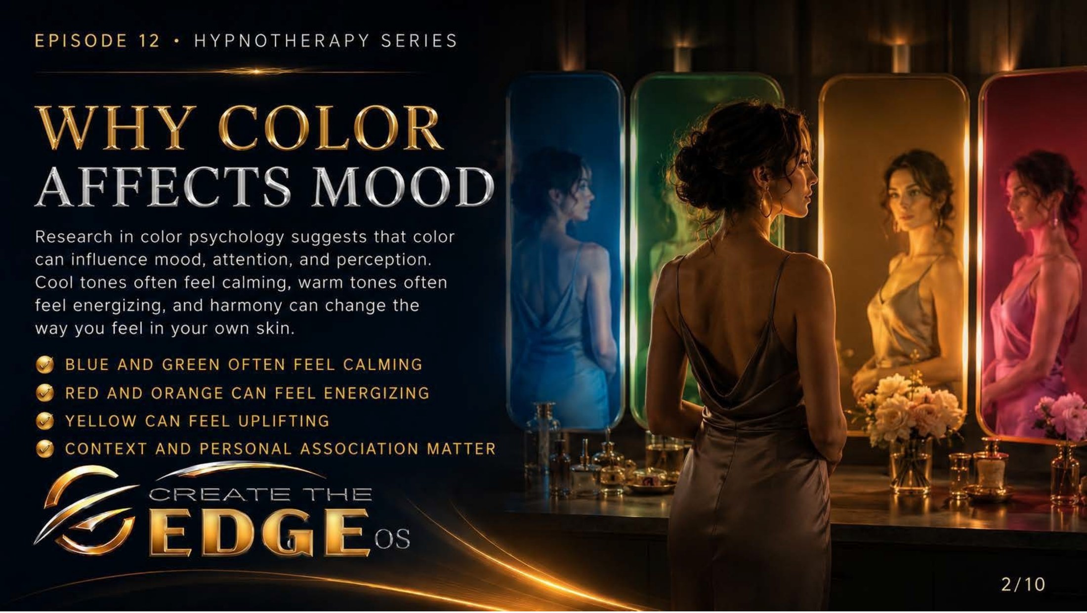
On the slideResearch in color psychology suggests that color can influence mood, attention, and perception. Cool tones often feel calming, warm tones often feel energizing, and harmony can change the way you feel in your own skin: blue and green often feel calming · red and orange can feel energizing · yellow can feel uplifting · context and personal association matter.
Episode 12 · Slide 2
Why Color Affects Mood
Look at this image for a moment, because it’s a beautiful little experiment in a single frame. A woman stands before a row of mirrors, each one lit a different color — cool blue, deep green, warm gold, glowing rose. And here’s what I want you to notice: she is the same woman in every mirror, but each colored light seems to tell a slightly different story about her. That’s not a trick of the picture. That’s how color actually works on the human nervous system.
The slide grounds this honestly: research in color psychology suggests that color can influence mood, attention, and perception. I want to keep both feet on the ground here, so let me be straight — color psychology isn’t physics, and it isn’t destiny. But there are real, observed tendencies in how human beings respond to color, and they’re worth understanding, because they’re working on you whether you study them or not.
The broad strokes are on the slide: cool tones — blues, greens — often feel calming, settling, like a held breath finally released. Warm tones — reds, oranges — often feel energizing, activating, like a hand on your back saying let’s go. And yellow, that strange and wonderful color, can feel genuinely uplifting, the visual equivalent of a sunrise. None of this is a rule. All of it is a tendency you can learn to feel.
But look at the fourth point, because it’s the most important one on the whole slide: context and personal association matter. This is where the generic charts end and you begin. The “calming” blue of a hospital gown and the calming blue of the ocean at dawn are the same wavelength and completely different experiences. Color never arrives alone. It arrives wrapped in your memories.
Let me show you what I mean. There may be a color you “should” love that you secretly can’t stand — and if you trace it back, you might find it’s the color of a uniform from an unhappy year, or a room where something hard happened. And there may be a color that lifts you for no reason the charts can explain — until you remember it was your grandmother’s kitchen, or the dress you felt beautiful in once. Your colors carry your history. That’s not interference. That’s richness.
This is exactly why I’ll never hand you a rigid color rulebook. The science gives us a map of tendencies, but you are the territory, and you are the final authority on what a color does to you. Your job in this chapter isn’t to memorize what blue is “supposed” to do. It’s to start noticing what blue actually does — to you, in your skin, with your particular history.
And here’s the empowering part hidden in all of this. If color is already moving your mood every single day — and it is — then you are not a passive passenger. You can begin to steer. You can reach, on a heavy morning, for the color that lifts you. You can surround yourself, on purpose, with the tones that settle your system. You stop being color’s subject and start being its author.
So take my hand and let’s get curious instead of dutiful. Forget what you’re “supposed” to like for a minute. We’re going to learn to read your own responses — the lift, the settle, the quiet yes — because those, not any chart, are the truest color guide you will ever own.
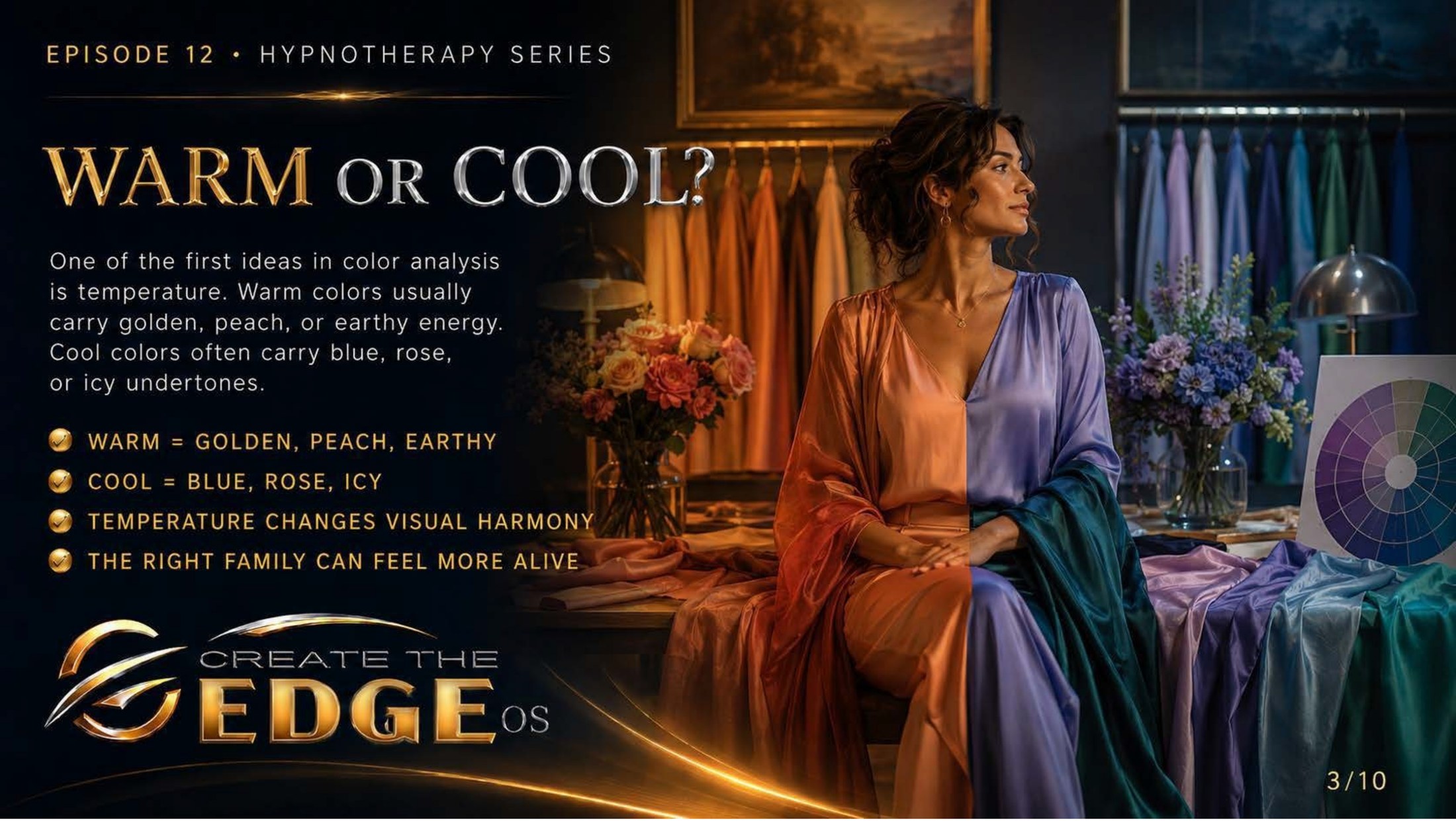
On the slideOne of the first ideas in color analysis is temperature. Warm colors usually carry golden, peach, or earthy energy. Cool colors often carry blue, rose, or icy undertones: warm = golden, peach, earthy · cool = blue, rose, icy · temperature changes visual harmony · the right family can feel more alive.
Episode 12 · Slide 3
Warm or Cool?
Here’s where it gets genuinely fun, and a little bit like a magic trick. Look at the woman in this image, draped so that one half of her glows in warm coral and gold, the other half in cool blue and teal. Same face. Same pose. And yet your eye can feel the difference — one side hums with sunset warmth, the other with moonlit calm. That split is the first big idea in color analysis, and the slide names it: temperature.
The concept is simpler than it sounds. Every color leans one of two directions underneath: warm or cool. Warm colors carry golden, peachy, earthy undertones — think honey, terracotta, warm ivory, the colors of a campfire and autumn leaves. Cool colors carry blue, rose, or icy undertones — think sapphire, raspberry, true white, the colors of snow and deep water. That’s it. That’s the whole foundation.
And here’s why it matters — the slide says it perfectly: the right family can feel more alive. When the temperature of a color harmonizes with your own natural coloring, something clicks. Your skin looks more luminous, your eyes a little brighter, the whole picture more you. When the temperature fights your coloring, you can end up looking tired or washed out — and here’s the cruel trick, you blame your face, when really you should blame the shirt.
Sit with that for a second, because it’s quietly liberating. How many times have you looked in a mirror, decided I look terrible today, and turned the verdict on yourself — your skin, your age, your tiredness — when the actual culprit was a color that simply wasn’t in your temperature family? You weren’t the problem. The undertone was. That’s a very different, much kinder story.
This is the part of the chapter that turns self-criticism into curiosity, and I love it for that. Instead of standing at the mirror cataloguing flaws, you get to become a kind of detective: huh — do I feel brighter in gold or in silver? Does warm ivory lift me, or does cool true-white? Which family makes my own face look back at me more alive? Suddenly the mirror is a place of experiment, not judgment.
And I want to gently take the pressure off, because color analysis can get turned into yet another rigid system to obey. You don’t have to get this “right.” You don’t have to banish a single color you love. Plenty of people are beautifully neutral, balanced between warm and cool, and look wonderful in both. This isn’t a cage. It’s a compass — a gentle pointer toward what tends to make you feel most like yourself.
Because that’s the real prize here, and it’s an emotional one, not a cosmetic one: feeling more alive. Not more “correct,” not more “flattering” by someone else’s ruler — more alive. More like the version of you that walks a little taller. Temperature is just the first tool for finding the colors that do that for you.
So take my hand, and let’s play with warm and cool together. Hold a gold thing and a silver thing up near your face sometime this week and just notice — no pressure, no grade. We’re not auditing your appearance. We’re hunting, gently and with curiosity, for the colors that make you feel most like yourself.

On the slideColor analysis often begins with undertone. The goal is not to judge the person, but to discover whether warm, cool, or more neutral color families bring greater harmony to the face: warm, cool, or neutral leaning · harmony can brighten the face · the wrong tone can feel off · draping helps reveal the difference.
Episode 12 · Slide 4
Undertone Changes Everything
I want to point you straight to the most important sentence on this slide, because it’s the heart of this whole chapter and it’s easy to skim past: the goal is not to judge the person. Read that twice. In a culture that has turned almost every aspect of appearance into a verdict, here is a practice that explicitly refuses to. Undertone analysis isn’t about ranking you. It’s about harmony — finding what sits well beside what.
Look at the woman in the image, holding two drapes up beneath her chin — a warm peach on one side, a cool periwinkle on the other — studying which one makes her own face come forward. That’s undertone work. It’s not asking “is she good enough?” It’s asking “which color keeps her company best?” Those are completely different questions, and the difference is everything.
So what is undertone? It’s the quiet color underneath your skin’s surface — not the tan or the freckles or the season’s color, but the subtle warmth or coolness beneath all of that. Some of us lean golden underneath, some lean rosy or blue, and many of us sit somewhere balanced in the middle. It’s subtle, it’s yours, and it doesn’t change with the weather or the years the way the surface does.
And here’s why the slide says undertone changes everything. When a color’s undertone harmonizes with yours, the slide’s phrase is exactly right — it can brighten the face. Shadows soften, the complexion looks more even, the eyes lift. When the undertone clashes, that same face can suddenly look drawn or sallow. The wrong tone, as the slide says, simply “feels off” — and you feel it before you can name it.
I think this is where so many women have been quietly hard on themselves for years without cause. You try on a color everyone swears is gorgeous, you look… not great, and you conclude something is wrong with you. But a color clashing with your undertone is not a flaw in your face. It’s a simple mismatch, as fixable as changing a shirt. The harmony was off. You never were.
Notice the gentle method the slide names — draping. You don’t analyze undertone by staring harder at your perceived flaws. You hold colors up near your face, one after another, and you watch what happens to the whole picture. Which drape makes your face step forward? Which one makes it recede? It’s observation, not judgment — and that shift, from judging to observing, is the same medicine this whole book has been offering all along.
And I’ll say it again because it matters: even if you discover a clear undertone, you are never forbidden a color you love. If a “clashing” red makes your heart sing, wear the red — joy harmonizes with everything. Undertone is a tool for the days you want a little extra ease and lift, not a fence around your closet. You remain, always, the one who decides.
So take my hand and let’s approach this the kind way. We’re not standing at the mirror to find what’s wrong with your face. We’re holding up colors to find which ones love your face back — which ones keep it good company. That’s not vanity. After everything you’ve been told to fix, choosing colors that simply make you feel at home in your own face is a small, real act of self-kindness.
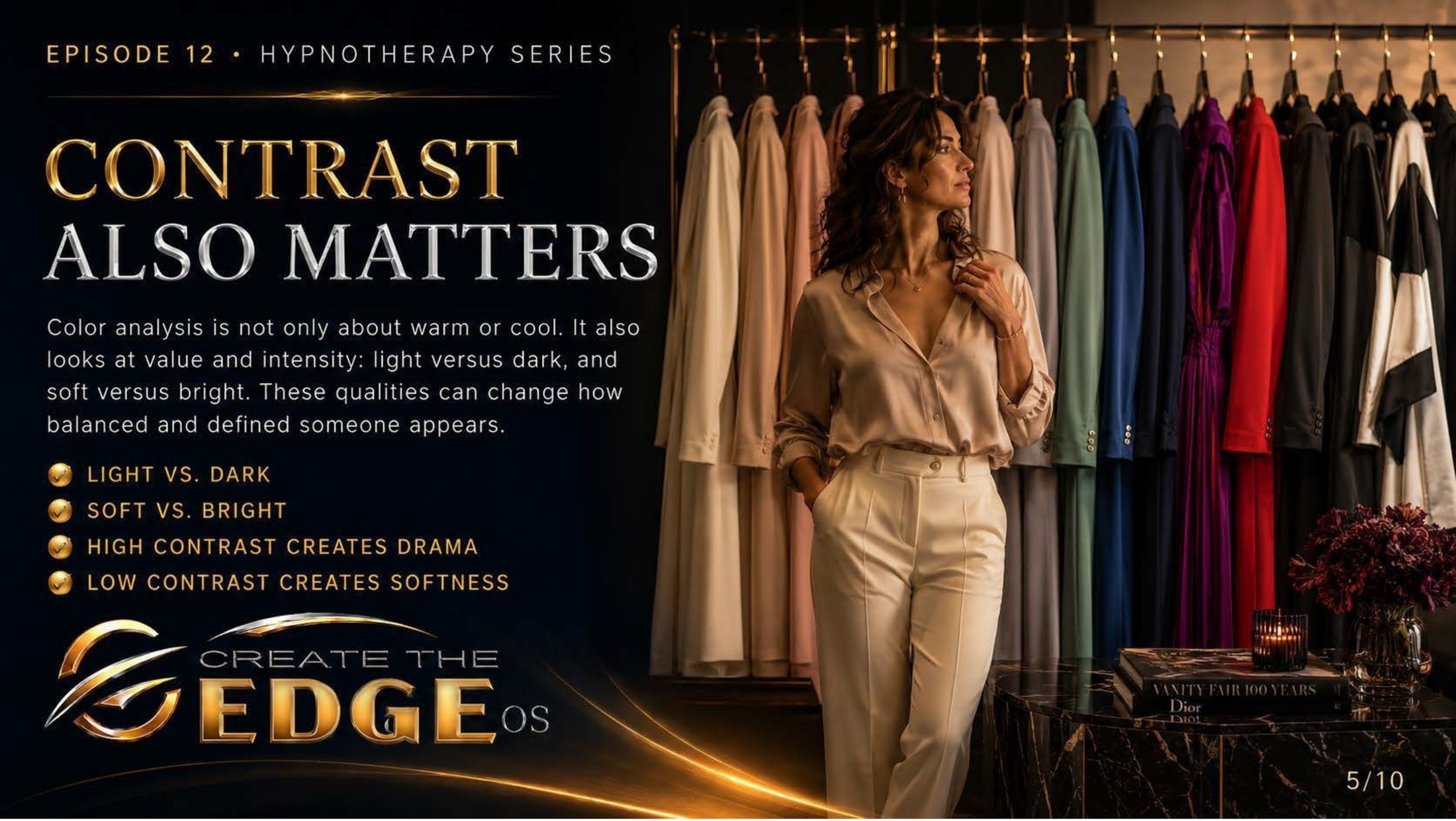
On the slideColor analysis is not only about warm or cool. It also looks at value and intensity: light versus dark, and soft versus bright. These qualities can change how balanced and defined someone appears: light vs. dark · soft vs. bright · high contrast creates drama · low contrast creates softness.
Episode 12 · Slide 5
Contrast Also Matters
So far we’ve talked about a color’s temperature — warm or cool. But the slide opens a second door, and it’s one most people never think about: contrast. Beyond whether a color is warm or cool, there’s the question of its value (how light or dark it is) and its intensity (how soft or bright). And these qualities, the slide tells us, change how balanced and defined the whole picture feels.
Let me make this concrete and human. Picture two women. One has dark hair and fair skin — a lot of natural contrast built right into her face, light and dark sitting side by side. Another has soft blonde hair and gentle coloring — low contrast, everything in a similar, blended range. Now imagine each of them in a sharp black-and-white outfit. On the high-contrast woman it might sing, echoing what her face already does. On the soft woman, that same outfit might overpower her, like shouting in a quiet room.
That’s the whole idea: it’s not just which colors, it’s how much distance between them. The slide lays it out cleanly — high contrast creates drama, low contrast creates softness. Neither is better. They’re just different instruments, and the art is matching the contrast in what you wear to the contrast that’s naturally, beautifully already you.
And here’s a quiet insight that’s freed a lot of people: sometimes a color combination feels “off” and you can’t say why, even though every individual color suits you. Often the culprit isn’t the colors at all — it’s the contrast level fighting your natural balance. The pieces were right. The distance between them was wrong. Once you can see that, a whole category of mysterious mirror-disappointment finally makes sense.
I find contrast strangely reassuring, and here’s why. It means harmony isn’t only about the “right” colors in isolation — it’s about relationship, about how things sit together. And isn’t that true of so much more than clothing? The same piece can be wrong in one pairing and perfect in another. Nothing about you needs fixing. Sometimes things just need to be placed beside what truly complements them — colors, and people, and lives.
Notice, too, that none of this is about hiding or shrinking or “balancing out” some supposed flaw. The slide’s language is about definition and harmony — about the whole picture feeling intentional and alive. This isn’t the old game of using clothes to disguise yourself. It’s the opposite: using color and contrast to let more of you come forward, clearly and on purpose.
And as always — this is a compass, never a cage. If you adore a high-drama look and your coloring is soft, wear it with your whole chest; “rules” bend gladly for joy and intention. Knowing your natural contrast just means that on the days you want effortless harmony, you know which direction to lean. Knowledge expands your choices. It never shrinks them.
So take my hand, and let’s add this second tool to the kit, lightly. Temperature, and now contrast. You’re not memorizing laws — you’re learning to see, with growing kindness, how the colors around you relate to the one-of-a-kind picture that is you. And the more clearly you see it, the more you realize: there was never anything to fix. Only things to harmonize.
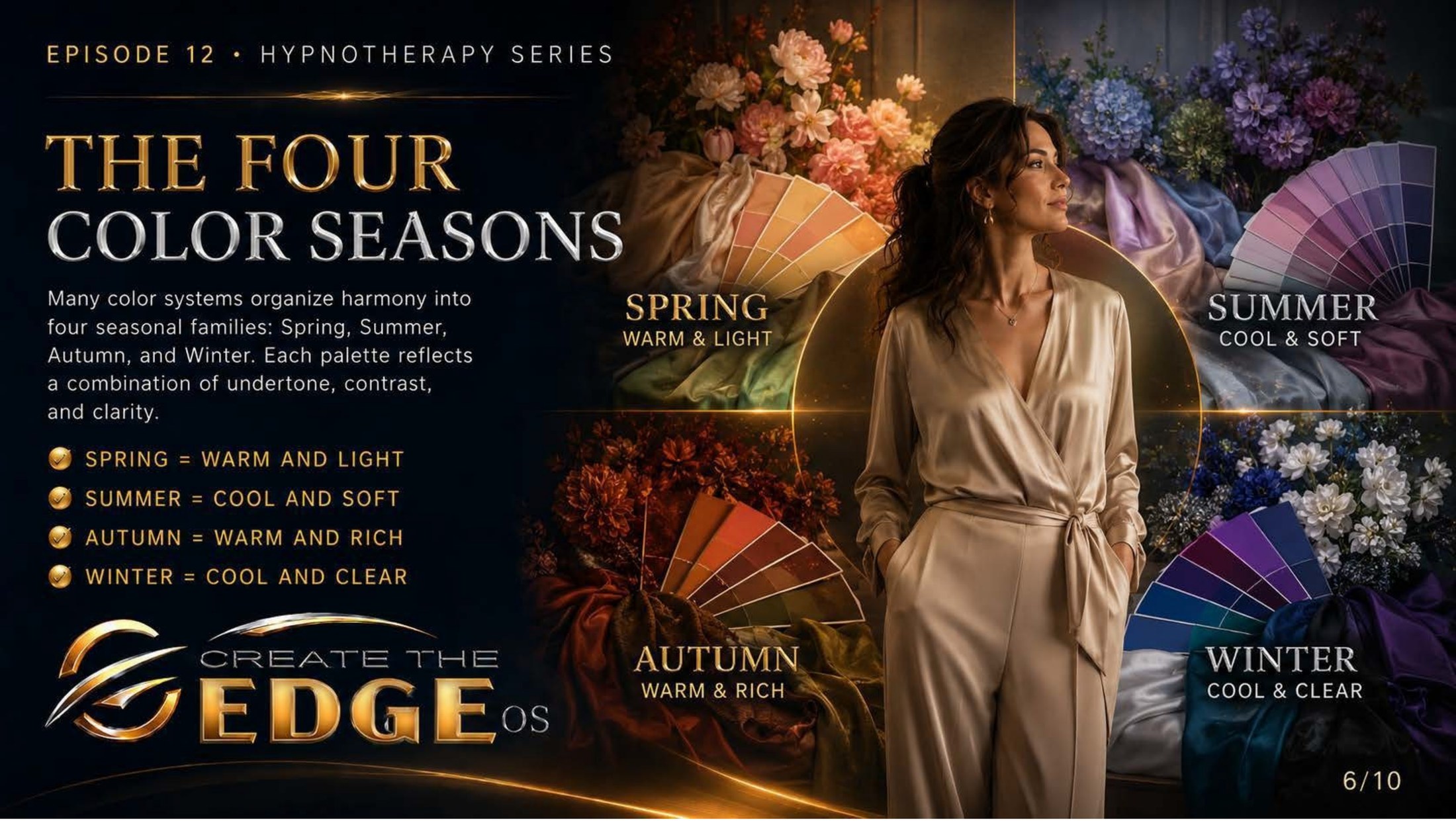
On the slideMany color systems organize harmony into four seasonal families: Spring, Summer, Autumn, and Winter. Each palette reflects a combination of undertone, contrast, and clarity: Spring = warm and light · Summer = cool and soft · Autumn = warm and rich · Winter = cool and clear.
Episode 12 · Slide 6
The Four Color Seasons
Now watch how beautifully it all comes together. Look at this image, with its four corners of color — Spring blooming warm and light, Summer cool and soft, Autumn warm and rich, Winter cool and clear. This is the famous “four seasons” framework, and it’s really just the elegant way that everything we’ve discussed — temperature, contrast, clarity — gets woven into four recognizable families.
Here’s the logic, and it’s satisfyingly simple once you see it. Take the two big questions — warm or cool, and soft or clear — and you get four natural combinations. Spring is warm and light, like the first bright blossoms. Summer is cool and soft, like a hazy seaside morning. Autumn is warm and rich, like turning leaves and spice. Winter is cool and clear, like snow against a bright sky. Four moods, four palettes.
And I want you to feel how poetic this is, because that’s part of why it has lasted. The seasons aren’t clinical categories — they’re moods, atmospheres, whole feelings. To be told your colors live in Autumn isn’t a diagnosis; it’s almost a little portrait. There’s a warmth and richness the world looks good on you in. That’s a kinder mirror than most of us have ever been handed.
But — and this matters as much as anything in this chapter — please hold these seasons lightly. The four-season system is a helpful map, not a sacred law, and plenty of real, gorgeous humans don’t fit cleanly into one box. Many people straddle two seasons. Many systems have since expanded to twelve or sixteen for exactly this reason. If you don’t fit a single season neatly, that’s not a failure — that’s just you being more nuanced than any four-part chart.
I’d gently warn you about one trap, because I’ve watched it catch good-hearted people. It’s easy to turn “finding your season” into one more anxious quest for the One Correct Answer — to feel you’ve failed if you can’t pin yourself down, or to start fearing every color outside your assigned palette. That’s the old perfectionism sneaking in the back door, wearing a prettier outfit. Don’t let it. This is meant to be play.
Think of your season — if you find one — as a home base, not a border wall. It’s a palette where harmony comes easily, a reliable place to start on a tired morning. It is absolutely not a list of forbidden colors or a fence you’re locked inside. A “Winter” can wear warm camel and look wonderful. The season is a starting point for ease, never a rule for restriction.
What I love most about this framework is how it reframes the whole question. It quietly insists there is no universally “best” color — only colors that harmonize with you. A shade that lights up a Spring might overwhelm a Summer, and neither shade nor person is “wrong.” In a world forever ranking people against a single impossible standard, that’s a genuinely radical, gentle idea: different, and beautiful, are the same sentence.
So take my hand and treat this like the dress-up box it’s meant to be. Maybe you’ll recognize yourself instantly in one of these four corners; maybe you’ll live happily between two. Either way, you’re not being sorted or graded. You’re being handed a palette and invited to play. After all the heavy work, you’ve more than earned an afternoon of color and delight.
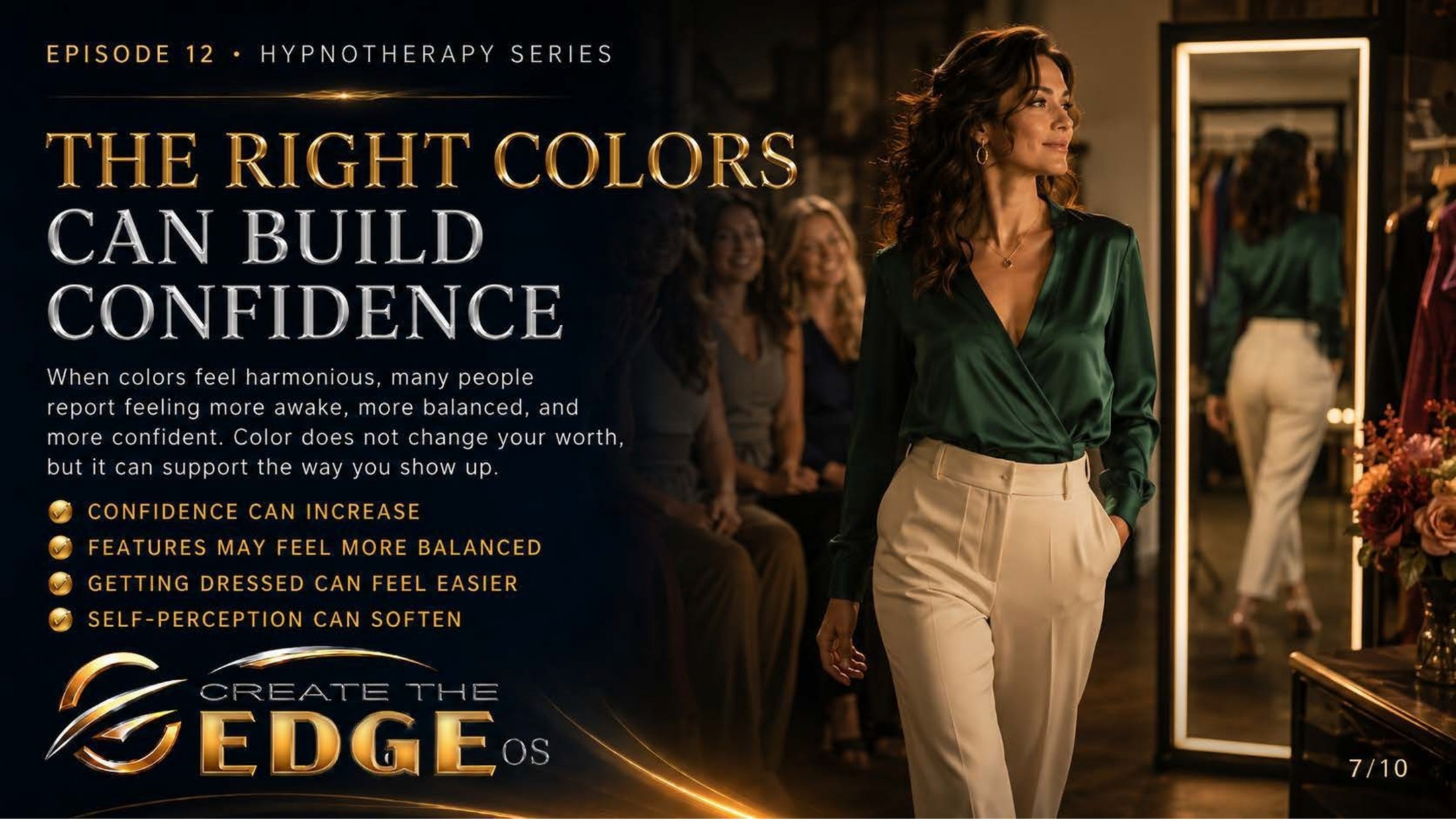
On the slideWhen colors feel harmonious, many people report feeling more awake, more balanced, and more confident. Color does not change your worth, but it can support the way you show up: confidence can increase · features may feel more balanced · getting dressed can feel easier · self-perception can soften.
Episode 12 · Slide 7
The Right Colors Can Build Confidence
Here is the line I most want you to carry out of this entire chapter, and the slide says it outright, so I’m going to say it louder: color does not change your worth. Nothing does. Your worth was never up for negotiation, never tied to a shade or a season or a size or a single thing about how you look. Please plant that flag deep before we go one sentence further, because everything else only makes sense once it’s firmly in the ground.
And — both things are true at once — the right colors can genuinely support the way you show up. Look at the woman in this image, walking past a row of admiring faces in a green that clearly agrees with her, her chin lifted, her whole bearing saying I know who I am today. Her worth didn’t increase when she put on that color. But her access to it — her felt sense of it — got easier. That’s the distinction that matters.
Let me make that difference crystal clear, because confusing the two is where so much pain lives. Color is not a source of worth — it’s a support for confidence. The worth is already there, total and permanent, on your worst-dressed, most exhausted day. The color is just a tool that can help you feel what was already true. It’s a key to a room you already own, not the deed to the house.
And notice how grounded and modest the slide’s promises are — I trust it more for that. It doesn’t say color will transform your life or fix your face. It says confidence can increase, getting dressed can feel easier, self-perception can soften. “Can,” not “will.” “Support,” not “save.” This is honest, human-sized help — the kind that actually shows up on a Tuesday.
Look especially at that last phrase: self-perception can soften. After all the work we did on the harsh inherited lens, isn’t it lovely that something as simple as color can be one more gentle hand on that softening? When you catch your reflection in a color that harmonizes with you, the inner critic often has just a little less to grab onto. The glance goes a degree kinder. Color can be a small, daily ally in the work of seeing yourself gently.
I think about the woman who has spent years dreading the mirror, bracing every morning for the interrogation. And I think how it might feel for her to discover that a handful of colors actually make that daily moment easier — not perfect, not magic, just easier. That “getting dressed can feel easier” isn’t a small promise to someone for whom getting dressed has been a battlefield. Sometimes easier is everything.
Here’s the deeper thing I want you to hold, though. The real confidence was never in the color — it was in you, learning to notice what supports you and then choosing it on purpose. That act of self-attunement, of saying I know what helps me feel like myself, and I’ll give it to myself — that’s the actual confidence. The color is just where you practiced it. The power was always yours.
So take my hand and hold both truths at once, the way grown-up wisdom always asks us to. You are worthy exactly as you are, in every color and in no color at all — and you’re allowed to use color, joyfully and without apology, to help yourself feel that worth more easily. Those don’t compete. Together, they’re freedom.
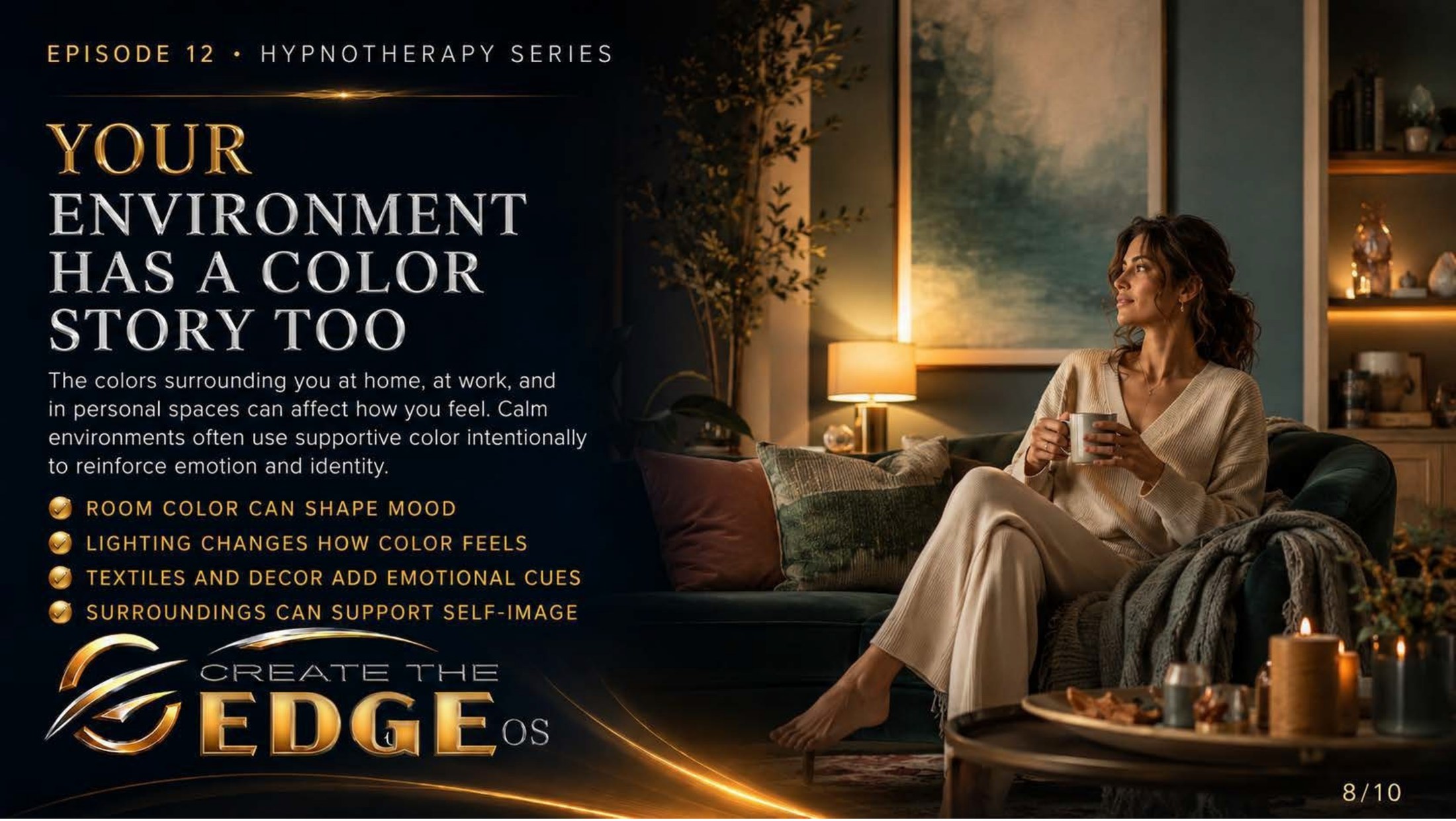
On the slideThe colors surrounding you at home, at work, and in personal spaces can affect how you feel. Calm environments often use supportive color intentionally to reinforce emotion and identity: room color can shape mood · lighting changes how color feels · textiles and decor add emotional cues · surroundings can support self-image.
Episode 12 · Slide 8
Your Environment Has a Color Story Too
We’ve been talking about the colors you wear. Now the slide opens the conversation wider, to something even more constant: the colors you live inside of. Look at the woman in this image, wrapped in soft cream and curled in a room of muted greens and warm lamplight, a cup of something warm in her hands. She isn’t getting dressed. She’s simply existing in a space — and that space is quietly shaping how she feels, breath by breath.
Here’s the thing about your environment that clothing can’t match: you take a colored outfit off at the end of the day, but you live inside your rooms for thousands of hours. The walls you wake up to, the light you get dressed under, the colors of the spaces where you work and rest — these aren’t a momentary choice. They’re a constant, low background hum, telling you a story about how the day should feel before you’ve had a single conscious thought.
The slide names the pieces beautifully: room color shapes mood, lighting changes how color feels, textiles and decor add emotional cues. And I want to linger on lighting especially, because it’s the secret nobody mentions — the same wall color can feel like a warm embrace under soft golden light and like a cold waiting room under harsh blue-white. You may not need new paint. You may just need to change the light falling on what you already have.
Notice the word the slide keeps returning to: intentionally. Calm environments use supportive color on purpose. And here’s the gentle reframe in that — most of us never chose our surroundings’ color story at all. We inherited the landlord’s beige, the previous owner’s taste, whatever was on sale, the accumulated accidents of years. Which means most of us are living inside a mood we never actually consented to. You get to change that. You get to choose, now, on purpose.
And this can be so wonderfully small. I’m not asking you to renovate or spend money you don’t have — please hear that. A single soft throw in a color that settles you. One warmer lightbulb in the corner where you read. Moving a chair into the morning sun. The slide calls these “emotional cues,” and you can begin layering them in with almost nothing but intention. Tiny shifts, real difference.
Look at that final point, because it ties this whole chapter back to its heart: surroundings can support self-image. The space you live in is constantly, silently reflecting something back to you about who you are and what you deserve. A room tended with even a little care and color whispers you matter, this comfort is for you. A space you’ve given up on can whisper the opposite. You are always, quietly, absorbing the message of your rooms.
So imagine deciding, on purpose, that the spaces around you will be on your side. Not magazine-perfect — perfection isn’t the point and never was — but supportive. A home that helps you feel calm instead of frayed. A corner that lifts you instead of draining you. This is self-care in its most literal, structural form: building an environment that holds you, instead of one that quietly works against you.
So take my hand and look around the room you’re in right now, gently, like a friend helping you see it fresh. What is it telling you? What’s one small color or light you could change this week to make this space a little more yours, a little more on your side? You spend your one precious life inside these rooms. They’re allowed to love you back.
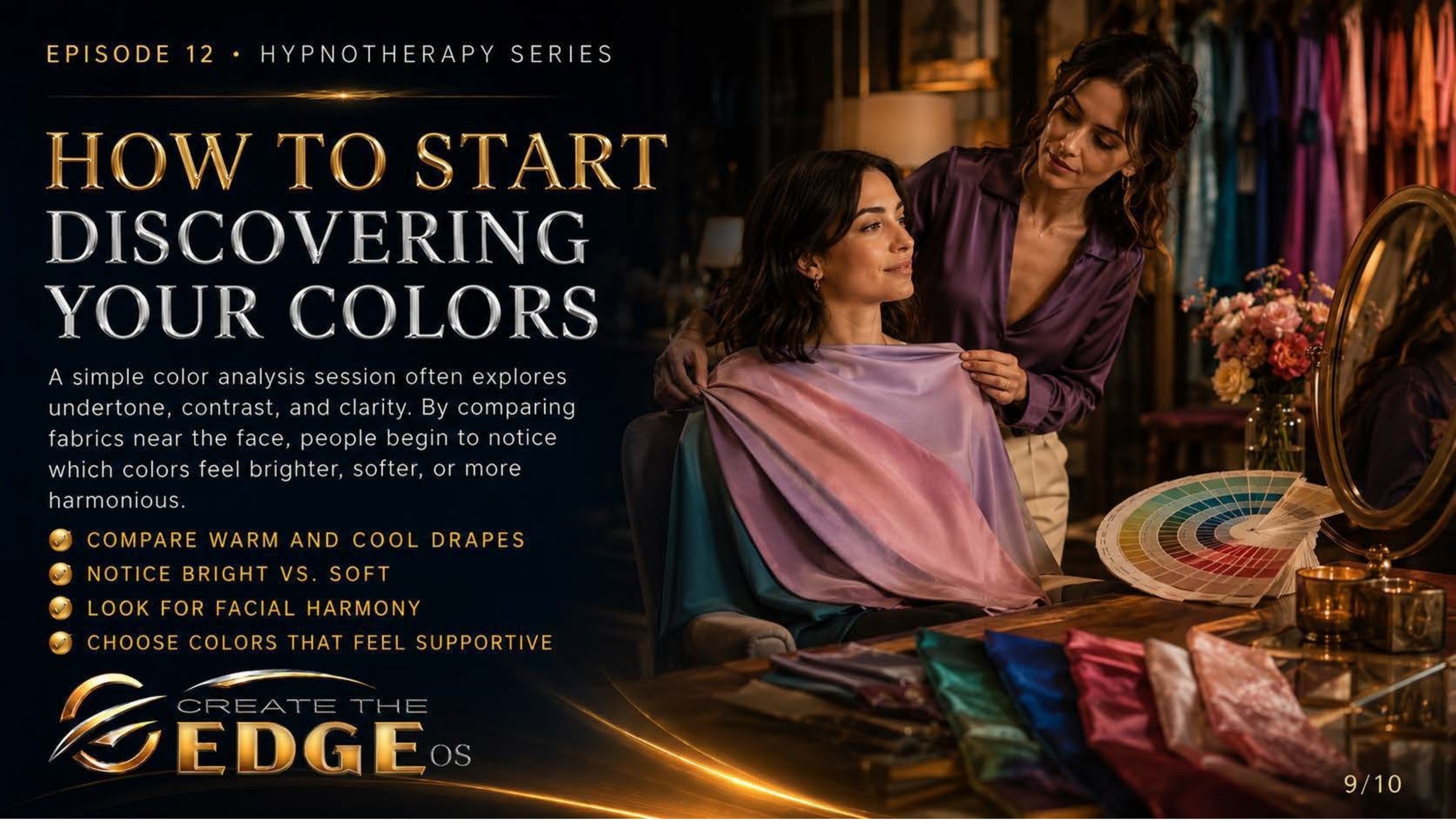
On the slideA simple color analysis session often explores undertone, contrast, and clarity. By comparing fabrics near the face, people begin to notice which colors feel brighter, softer, or more harmonious: compare warm and cool drapes · notice bright vs. soft · look for facial harmony · choose colors that feel supportive.
Episode 12 · Slide 9
How to Start Discovering Your Colors
Now let’s make it real and doable, because everything we’ve discussed can stay pleasantly abstract until you actually try it. Look at this image — one woman gently draping fabric near another’s face, a fan of color swatches and silks spread out beside them. This is what “discovering your colors” actually looks like in practice, and the beautiful part is how simple and how kind the whole process is.
The method the slide describes is almost childlike in its ease: you hold different colors up near your face, one after another, and you notice. That’s it. No special training, no equipment, no expert verdict required to begin. Compare a warm drape against a cool one. Compare a bright color against a soft one. And then simply watch what happens — to your face, and to how you feel looking at it.
The slide gives you the exact questions to hold, and I love how gentle they are: which colors make your face seem to brighten? Which make it seem to recede or tire? Where do you see harmony — the whole picture clicking into place? You’re not hunting for flaws to fix. You’re watching for the colors that make your own face come forward, more alive, more present. It’s a search for what works, not what’s wrong.
Let me give you the simplest possible starting point, something you can do this very week with things you already own. Find a window with good natural daylight — daylight tells the truth in a way that harsh bathroom bulbs never will. Hold up a few different-colored tops or scarves near your face, one at a time. And just notice the first instinct, before the critic wakes up: oh, that one lifts me. That one drains me. Trust that first quiet flicker. It’s usually right.
And here is the most important instruction in the whole exercise, the one that separates this from every harsh appraisal you’ve ever inflicted on yourself: be kind while you do it. This is not the old mirror interrogation in a clever new costume. You are not standing there to find everything wrong with your face. You are standing there as a curious, gentle friend, discovering what makes this face — your real, lived-in, irreplaceable face — feel most alive.
Look at that last step on the slide, because it’s the quiet revolution of the entire chapter: choose colors that feel supportive. Not colors that “fix” you. Not colors that hide you or shrink you or make you acceptable to some invisible judge. Colors that support you — that make getting dressed easier, that meet your reflection with a little more warmth. The whole frame has shifted from correction to care.
And you don’t need a professional or a single dollar to begin — though a session with a real color analyst can be a genuine delight if you ever want one. The discovery starts the moment you start paying attention, which is free, and yours, and available right now. The expert can refine it later. The noticing belongs to you today.
So take my hand and let’s make this a gentle experiment, not a test. Sometime this week, by a sunny window, hold a few colors to your face and just notice — with curiosity, with kindness, with the lightness of someone playing rather than judging. You’re not auditing your appearance. You’re getting to know yourself, one color at a time. And that, it turns out, can be a surprisingly tender way to spend an afternoon.
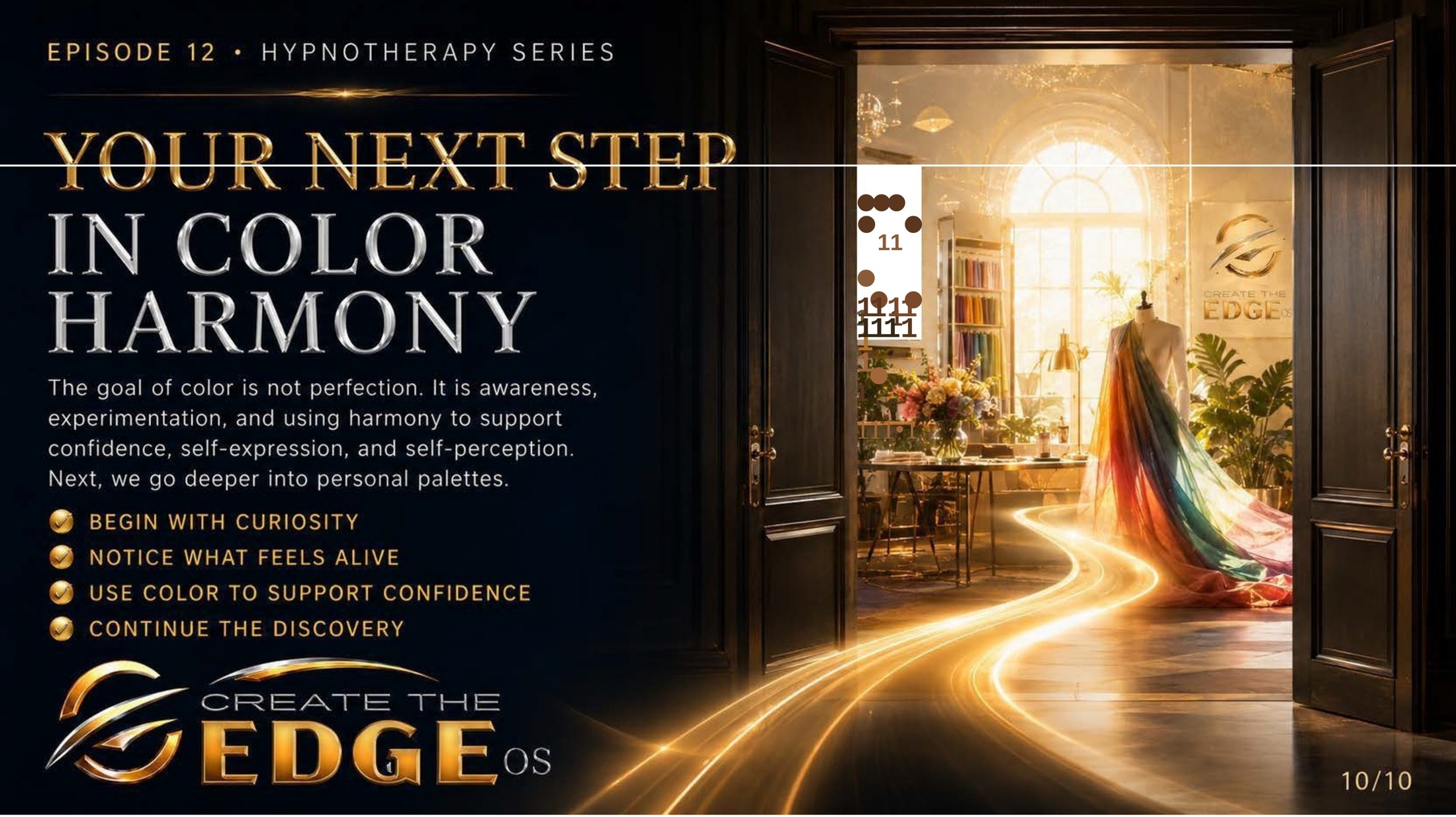
On the slideThe goal of color is not perfection. It is awareness, experimentation, and using harmony to support confidence, self-expression, and self-perception. Next, we go deeper into personal palettes: begin with curiosity · notice what feels alive · use color to support confidence · continue the discovery.
Episode 12 · Slide 10
Your Next Step in Color Harmony
Look at the doors again. We end this chapter the way we ended the last — at an open threshold, golden light spilling out along a path, a flow of color streaming through the doorway toward a bright studio beyond. The image is telling you the same true thing in a new language: there’s more here to explore, the door is open, and the invitation is yours to accept whenever you’re ready.
And read the very first words on this slide, because they are the soul of everything we’ve done: the goal of color is not perfection. After a lifetime of being sold the opposite — the perfect shade, the perfect palette, the flawless look — here is a practice that lays perfection down at the door. The goal, the slide says, is awareness, experimentation, and harmony. Not a grade. Not an arrival. A way of paying attention.
Sit with those three words, because they’re a gentle antidote to everything that ever made you anxious about how you look. Awareness — simply noticing what color does to you. Experimentation — playing, trying, with no possibility of failing, because play can’t fail. Harmony — the quiet click of things sitting well together. There is no way to do any of these “wrong.” There’s only the doing, and the noticing, and the delight.
Read the four invitations on the door, and feel how light their hands are on your shoulder: begin with curiosity, notice what feels alive, use color to support confidence, continue the discovery. Not one of them is a command. Not one carries a threat of failure. They’re the kindest kind of guidance — the sort that trusts you to explore at your own pace and find your own way. Begin with curiosity. What a gentle place to start anything.
I keep returning to that phrase — notice what feels alive. Because in the end, that’s the only color rule that ever truly mattered, the one beneath all the temperature and contrast and seasons. Forget every “should.” Forget the charts if you want to. The deepest question is simply: which colors make you feel more alive? Follow that, and you cannot get this wrong.
Let me speak to you plainly as we stand in this doorway, the way I have all along. This whole chapter has been a quiet act of reclaiming. You came into it carrying years of using appearance as a weapon against yourself — and you’re leaving it holding color as a gift instead. Same mirror, same face, completely different relationship. That’s not a small thing. That’s the very healing this book is for, showing up in something as everyday as getting dressed.
So here is my hand, one more time — not from some far shore where I’ve got it all figured out, because I haven’t and I never will fully arrive. I still discover new colors that lift me. I still get it “wrong” and laugh and change my shirt. We don’t fail, we fall forward, and we keep playing, and we go together, because joy was always meant to be shared and never hoarded.
The doors are open. The light is gold. The goal was never perfection — it was awareness, and play, and choosing on purpose the colors that make you feel most like yourself. The workbook on the next pages is where you take your first real step through. Bring your curiosity. Bring your kindness. With new eyes, and my hand in yours, let’s walk into your next chapter of color and harmony. I’ll be right here, the whole way.